+ Project Synopsis

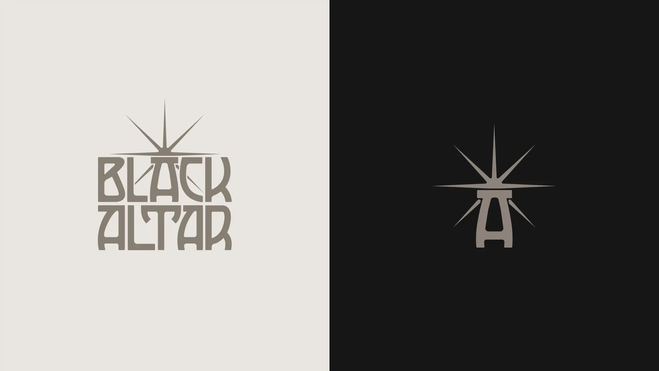
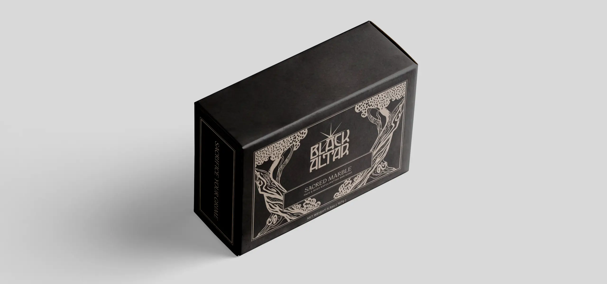
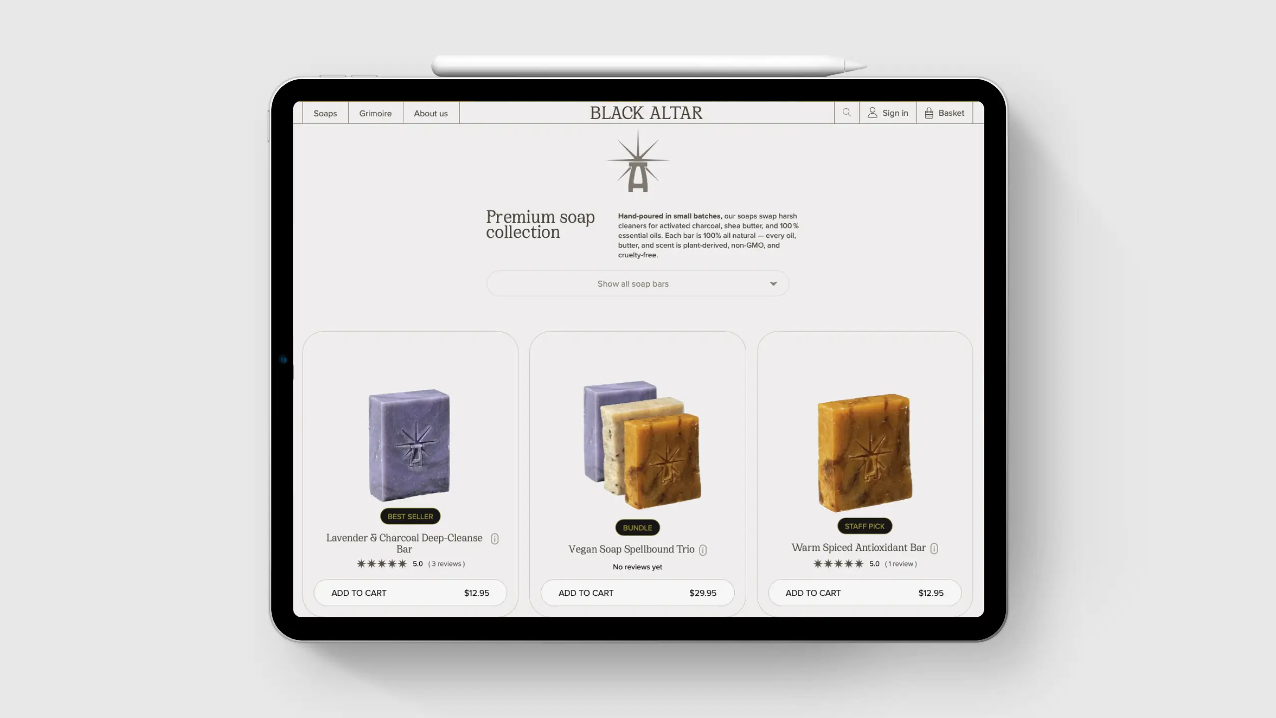
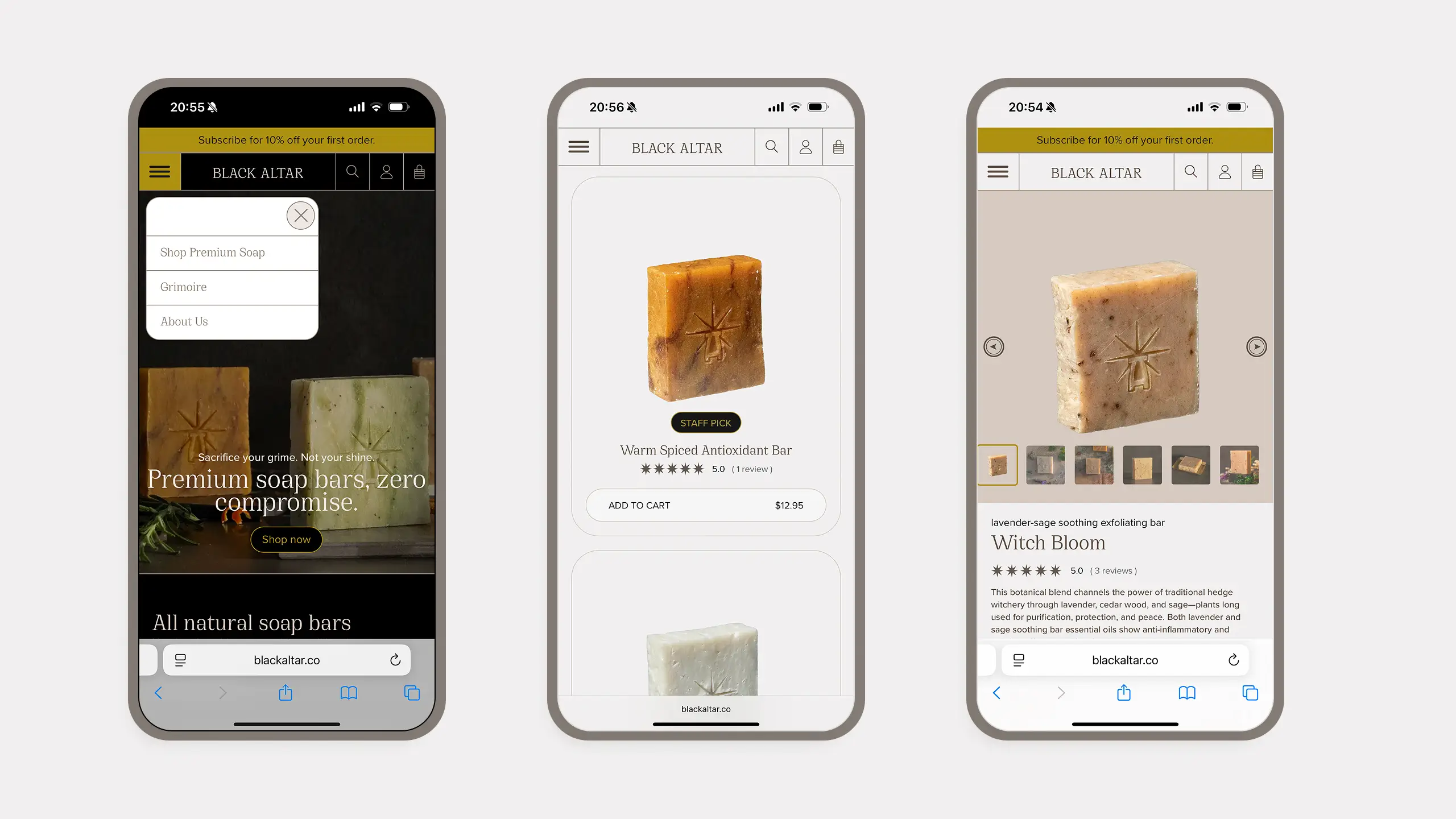
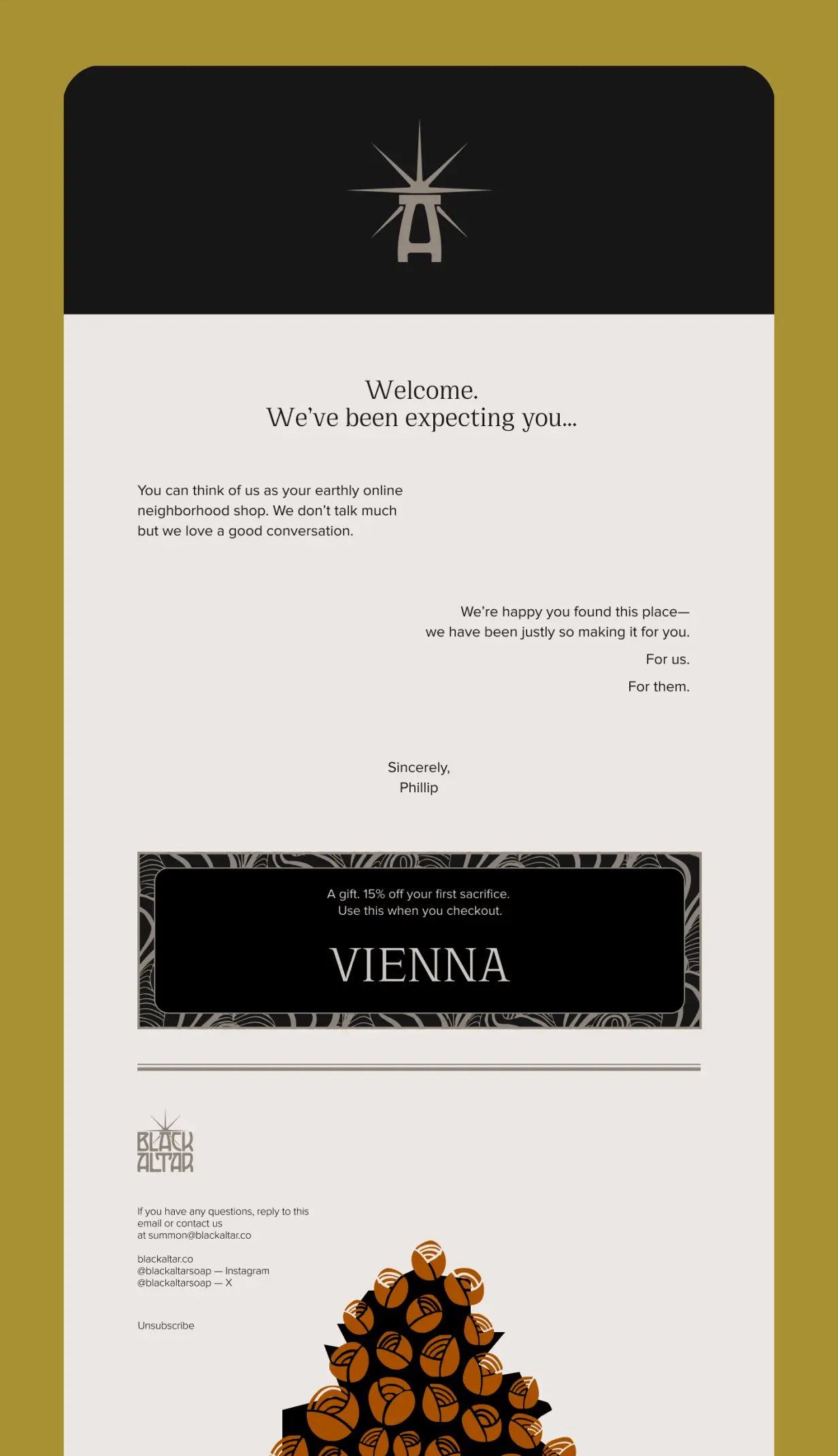
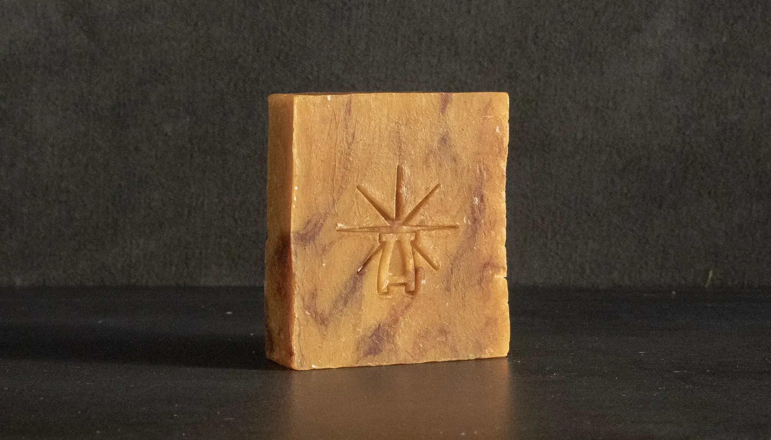
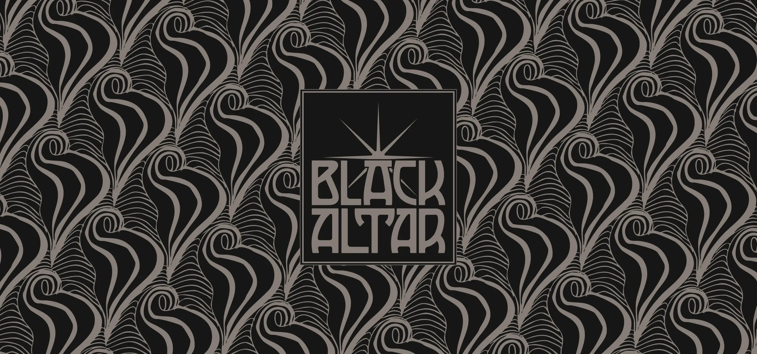
Black Altar turns wash-up into a minor act of rebellion. We drew a hand-cut logotype crowned by an altar-shaped A—simple enough to for the altar to stand alone, sharp enough to nod at the Vienna-Secession movement. The brand says it best: “Sacrifice your grime. Not your shine.”

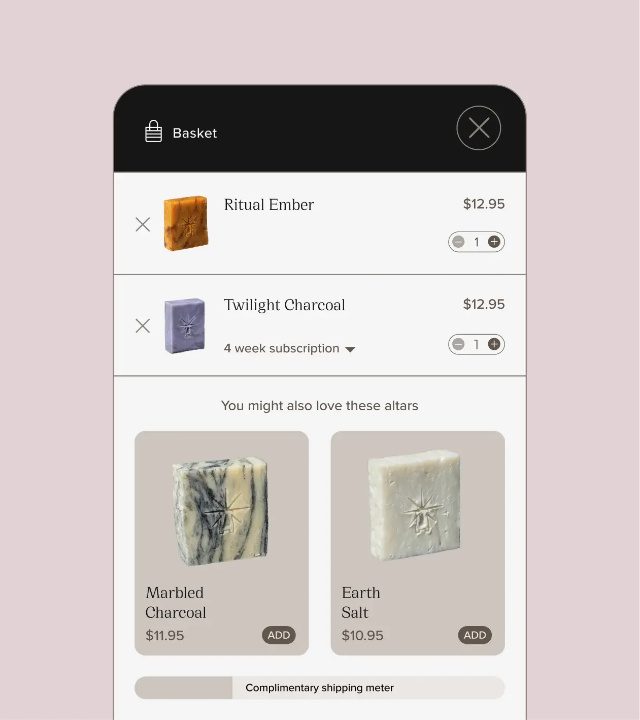
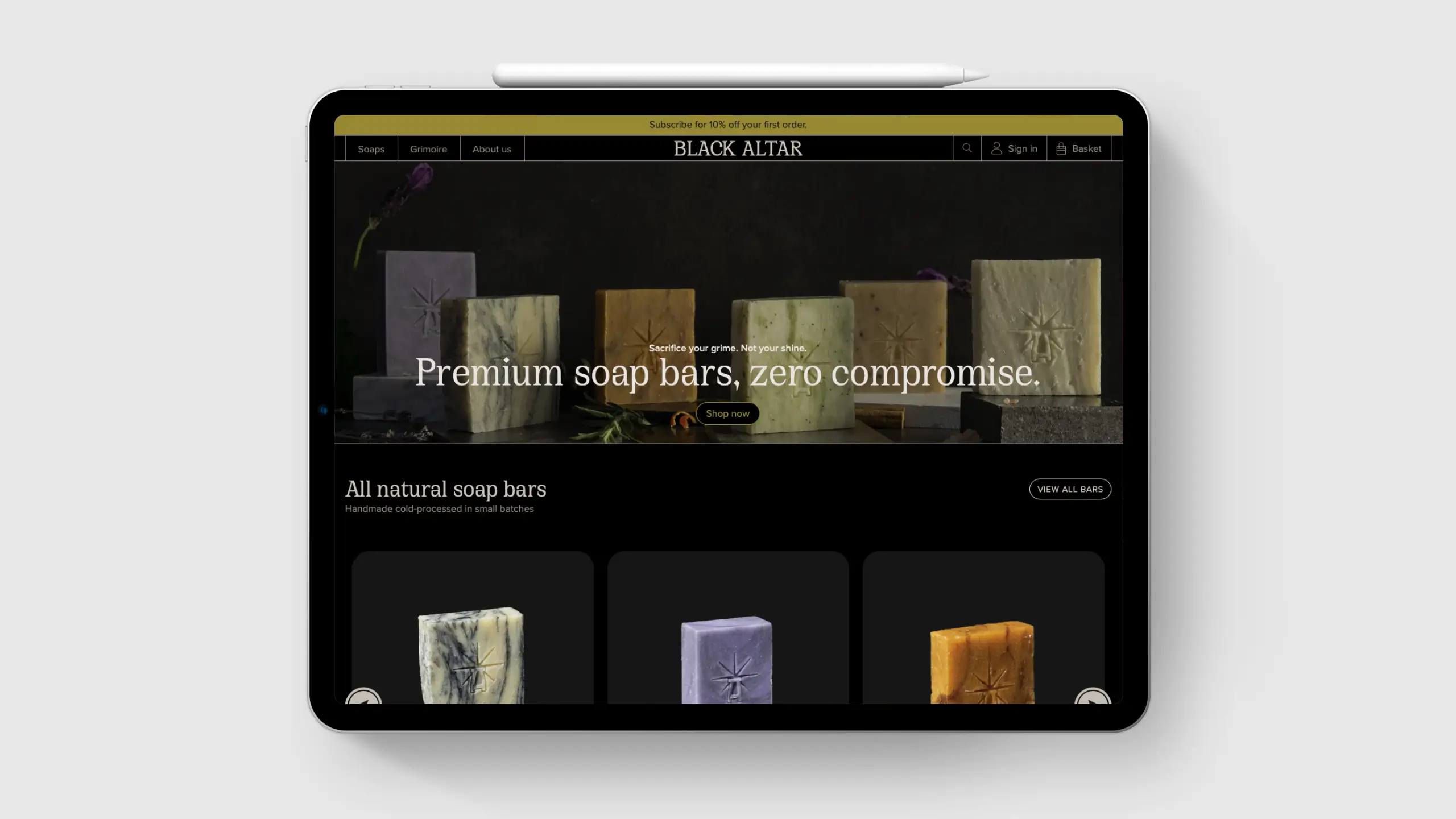
We developed a straight-talk attitude that carries through every touch-point: matte-black cartons, woodcut-style illustrations, and product staging. Online, the lights stay low and the copy stays bold yet simple—“Your grime is your glory.”

Services:

Branding

Creative Strategy

Creative Technology

Graphic Design

Illustration

Photography

Print and Editorial

Typography

User Experience

User Interface

Web Design

Web Development

all six images lined up in a moody dark setting surrounded by ingredients
the website logo sits next to the brand mark
the website cart before checkout
brand colors shown as bands
The brand gift card sits beautifully atop a marble altar. The illustration showing two trees of life and the logo.
all 6 soaps, each showing their names and chosen colored backgrounds
Packaging design for the black altar bar
the website homepage shown on an ipad pro
The shop soaps page shown on an ipad pro
3 mobile screens are shown
An image showcasing email design
Two images, one above the other. The top one features thw "witch bloom" soap on a black marble altar surrounded by ingredients. The bottom is a line up of all 6 soaps.
Orange roses illustrations with the brand symbol obscured in the background
an illustration of a lower body lying in the sun
a single bar of soap stands alone in a dark marble smokey environment
Black Altar logo surrounded by vienna secession styled illustration